Practical Typography
Matthew Butterick · 2013
Writing, design and web craft › Typography
#312 most recommended
Hacker News
132
mentions by 113 people · top 3% of 15,732 books
Open Library
—
Not on Open Library reading logs yet
Wikipedia
—
No article yet
About the book
A practical guide to typography for professional writing, covering the everyday decisions that shape a document's text: punctuation and spacing, choosing and setting typefaces, and sizing and arranging text on the page. It is aimed at people who write and format documents, not at type designers. Good typography comes from a small number of specific, learnable choices made on purpose, not from the defaults that word processors ship with. The book holds that these choices, such as using real quotation marks and dashes, limiting line length, and setting body text at a readable size and spacing, make text easier to read and make the writer look more professional. It presents them as concrete rules with reasons rather than as matters of taste.
Written by Claude from what it knows of this book.
What Hacker News says 87% recommend · 10% critical
In the commenters’ own words
1) Startups/business. If you haven't, I would read all of Paul Grahams essays. I think startups are a great option (…
I'm a 3rd year undergraduate student and for various reasons I'm taking the rest of the year out and returning to studying Electronic Engineering next…
What Open Library readers say
Open Library has no ratings or reading logs for this book yet.
What critics say, via Wikipedia
No Wikipedia article about this book yet, so no critics to quote.
Reddit communities — coming later
The threads it came up in
Details
- First published
- 2013
- Editions known
- none recorded at Open Library
Read next: its neighbours on the mosaic
 Beautiful RacketMatthew Butterick · 2017 · recommended by 44 people · 4 people recommended both
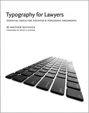 Typography for lawyersMatthew Butterick · 2010 · recommended by 12 people · named together in 3 comments
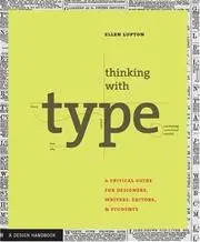 Thinking with TypeEllen Lupton · 2004 · recommended by 19 people · similar by subject and what people say about it
 How to Design ProgramsMatthias Felleisen · 2001 · recommended by 277 people · 7 people recommended both
 Practical Foundations for Programming LanguagesRobert Harper · 2016 · recommended by 17 people · 2 people recommended both
 The Elements of Typographic StyleRobert Bringhurst · 1992 · recommended by 85 people · similar by subject and what people say about it
 Don't Make Me ThinkSteve Krug · 2000 · recommended by 256 people · 2 people recommended both
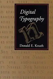 Digital typographyDonald Knuth · 1999 · recommended by 6 people · similar by subject and what people say about it
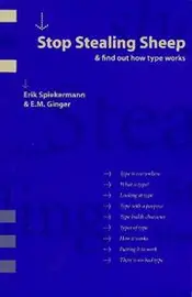 Stop stealing sheep & find out how type worksErik Spiekermann · 1993 · recommended by 6 people · similar by subject and what people say about it
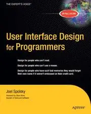 User Interface Design for ProgrammersJoel Spolsky · 2001 · recommended by 18 people · similar by subject and what people say about it
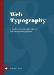 Web TypographyRichard Rutter · 2017 · recommended by 1 person · similar by subject and what people say about it
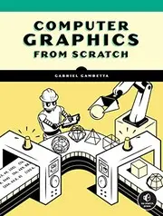 Computer Graphics from ScratchGabriel Gambetta · 2020 · recommended by 12 people · similar by subject and what people say about it
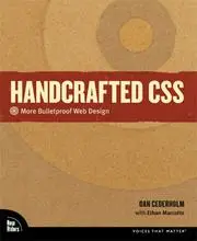 Handcrafted CSSDan Cederholm · 2010 · recommended by 5 people · similar by subject and what people say about it
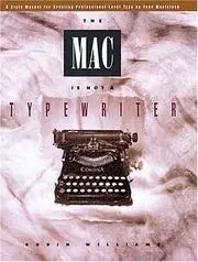 The Mac is not a typewriterRobin Williams · 1989 · recommended by 11 people · similar by subject and what people say about it
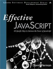 Effective JavaScriptDavid Herman · 2012 · recommended by 20 people · similar by subject and what people say about it
 Refactoring UIAdam Wathan · 2018 · recommended by 129 people · similar by subject and what people say about it
 The complete manual of typographyJames Felici · 2011 · recommended by 3 people · similar by subject and what people say about it
 Design for HackersDavid Kadavy · 2011 · recommended by 45 people · similar by subject and what people say about it
 Learn You a Haskell for Great Good!Miran Lipovača · 2011 · recommended by 237 people · 2 people recommended both
 The Humane InterfaceJef Raskin · 2000 · recommended by 54 people · similar by subject and what people say about it
 StyleJoseph M. Williams · 1981 · recommended by 38 people · similar by subject and what people say about it
 The Non-Designer's Design BookRobin Williams · 1994 · recommended by 75 people · similar by subject and what people say about it
 Rocket Surgery Made EasySteve Krug · 2009 · recommended by 19 people · similar by subject and what people say about it
 The Little TyperDaniel P. Friedman · 2018 · recommended by 16 people · similar by subject and what people say about it